Hey there, fellow creators! 🎨 So, you’re diving into the world of YouTube and ready to make your channel pop? Well, you’ve come to the right place! Think of your YouTube banner as the welcoming mat to your digital abode—it’s the first thing viewers see when they hit your channel, and we all know how important first impressions are. So, how do you make yours perfectly sized and utterly eye-catching? In this ultimate guide, we’re going to break down everything you need to know about YouTube banners, from ideal dimensions to creative design tips that’ll help your channel stand out in a sea of content. Whether you’re just starting or looking to refresh your existing banner, get ready for a friendly and informative ride that’ll spark your creativity and make your channel the place to be. Let’s jump in, shall we? 🚀
Crafting Your Visual Identity with the Right Dimensions
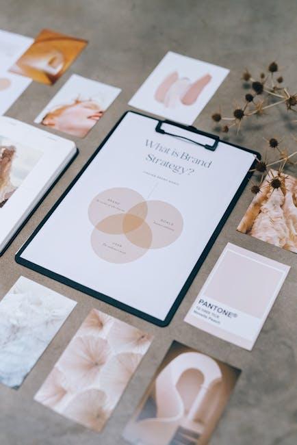
When it comes to establishing your brand, the dimensions of your visual content play a pivotal role. Think of your YouTube banner as the front cover of a book—it’s the first impression viewers get, and you want it to be unforgettable! The optimal size for YouTube banners is 2560 x 1440 pixels. This ensures that your message is clear, vibrant, and effectively displayed across various devices. But don’t stop there! Pay attention to the safe area within the banner, which is a central box measuring 1546 x 423 pixels, where crucial text and logos should reside. This way, whether someone’s watching on a smartphone, tablet, or desktop, your key visuals won’t get cropped out of the picture.
Now, let’s dive a bit deeper into the elements that will make your banner pop! Here are some tips to keep in mind when designing your visual identity:
- Brand Colors: Use colors that are consistent with your overall branding to create familiarity.
- Typography: Choose fonts that are readable and reflect your channel’s vibe. No one wants to squint at a banner to read your channel name!
- Images: Incorporate high-quality images that resonate with your content.
Think of your visual identity as a handshake; it should be firm and welcoming, leaving a lasting impression on your viewers. So grab their attention right off the bat and let your banner do the talking!
Understanding the Essentials of Eye-Catching Design
When it comes to grabbing attention, design isn’t just about slapping on a few bright colors and hoping for the best. It’s about creating a visual experience that resonates with your audience. Think of it like laying the foundation for a house; if the groundwork isn’t solid, the whole structure is at risk. So, what does eye-catching design mean in the world of YouTube banners? Well, it starts with balance and harmony. You want your elements—text, images, and colors—to work together cohesively. Too much chaos can turn people away, while a well-structured layout beckons viewers in like a cozy cafe on a chilly day.
Another key aspect to consider is brand consistency. Your banner is an extension of your brand, speaking volumes about your identity and values in just a glance. Incorporating the same hues, fonts, and imagery you use across other platforms reinforces your message. Think of your brand like a familiar song; if all the notes hit the right chord, it creates a melody that sticks in people’s minds. Here’s a quick checklist to keep in mind for your banner design:
- Clear and readable fonts
- Appropriate color schemes
- High-quality imagery
- Consistent branding
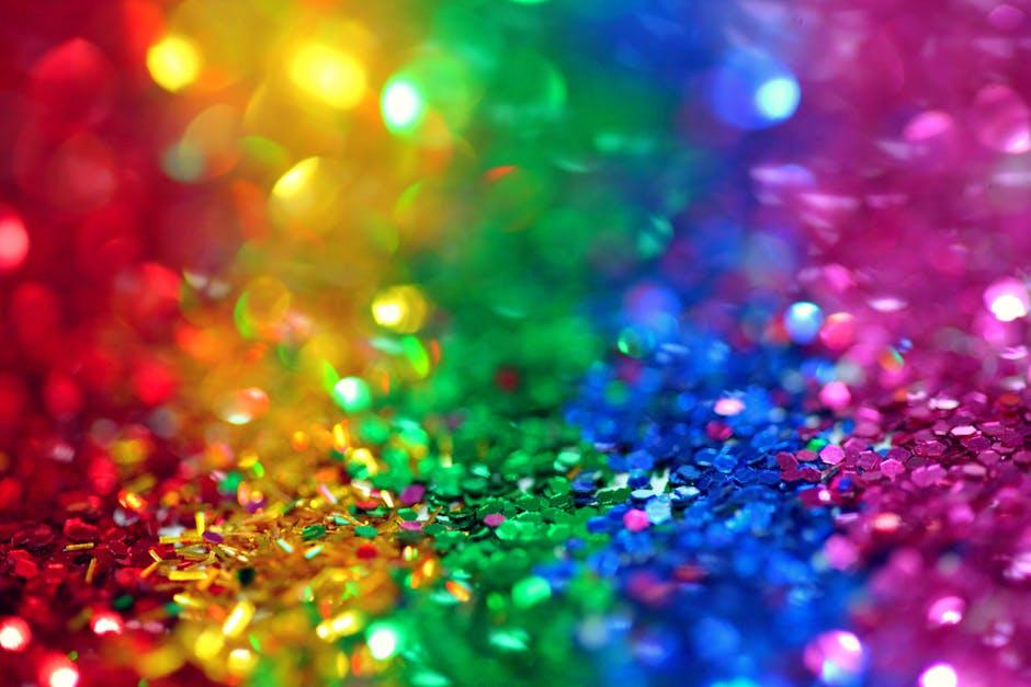
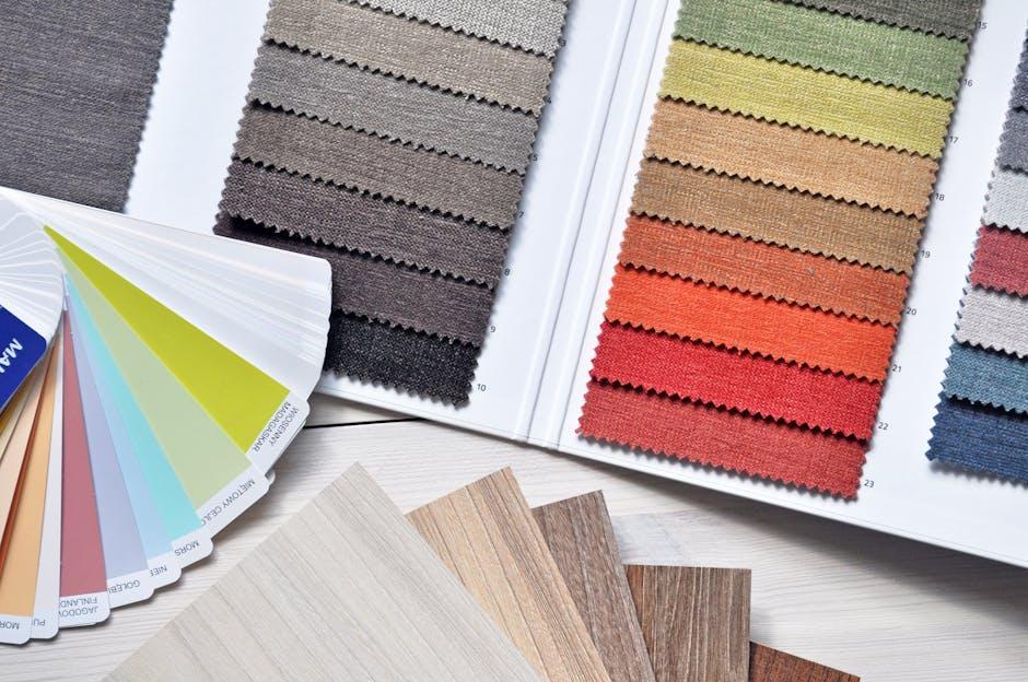
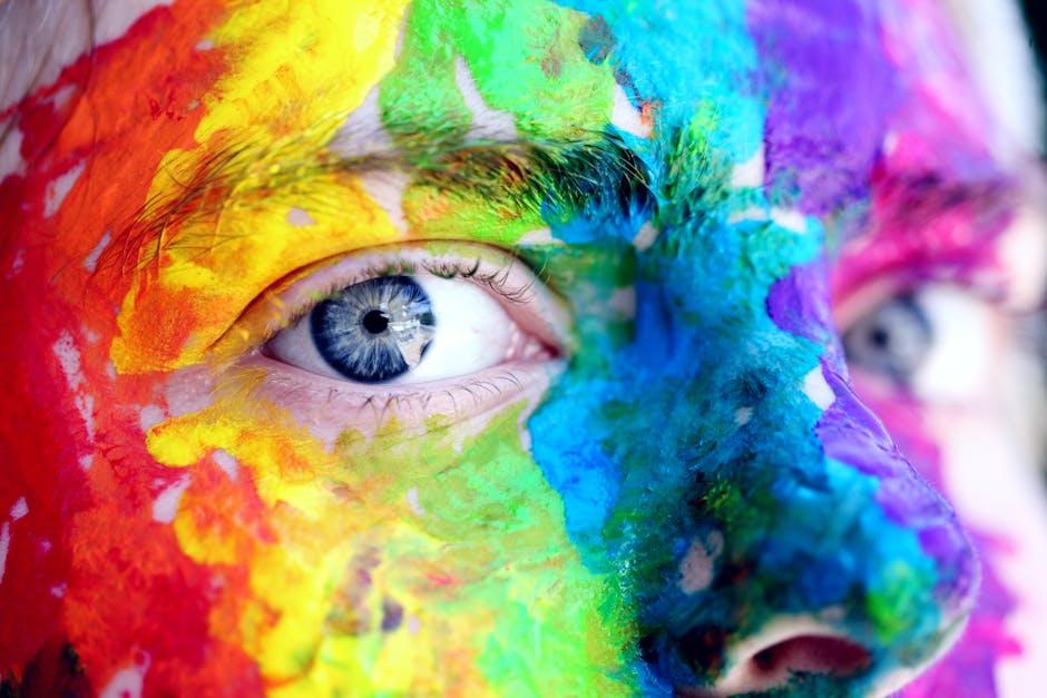
Colors and Fonts that Speak to Your Audience
When it comes to designing your YouTube banner, the colors and fonts you choose can make or break your channel’s vibe. Think about it: colors evoke emotions. Do you want your audience to feel energized and excited? Go for vibrant colors like reds and yellows. Looking for something more calming? Soft blues and greens will set the mood. Each shade tells a story; so pick wisely! Fonts matter just as much – they communicate your brand’s personality. Sleek, modern fonts can suggest professionalism, while quirky, playful fonts can give your channel a more relaxed, fun feel. The right mix can spark interest and keep viewers coming back for more.
To nail the perfect aesthetic, consider these essential tips:
- Consistency is key: Use a limited palette of colors and a cohesive font family across all your branding materials.
- Contrast: Ensure there’s enough contrast between your text and background for easy readability; nobody wants to squint!
- Keep it simple: Don’t overload your banner with too many colors or font styles. Sometimes less is more.
Here’s a quick reference table to illustrate the emotional feel of different colors and matching font styles:
| Color | Emotion | Recommended Font Style |
|---|---|---|
| Red | Energy, Passion | Bold Sans Serif |
| Blue | Trust, Calm | Clean Serif |
| Yellow | Happiness, Optimism | Playful Script |
| Green | Growth, Harmony | Simple Sans Serif |
Maximizing Impact: Tips for Engaging Your Banner Content
To truly stand out with your banner content, it’s all about delivering a message that resonates. First things first, visual appeal is key—think bold colors, striking images, and a cohesive theme that aligns with your brand. Use clean typography that’s easy to read even on smaller devices. Remember, your banner is the first impression visitors will have; make it one they won’t forget! Consider using eye-catching elements to draw attention, like engaging calls to action that invite viewers to click, subscribe, or explore more. Ask yourself: is my banner telling a story? A compelling narrative can keep folks glued to your channel.
Next, once you have the basics down, don’t forget about strategic placement of elements. Group related content together to create a flow that guides your audience through the visual landscape. Maybe you want to highlight your social media links, showcase your latest videos, or even share upcoming events. An effective tip is to use contrasting colors to make these sections pop. And speaking of layouts, keeping it responsive is vital. Check how your banner looks across devices; a mobile-friendly design ensures that your message gets across no matter the screen size. After all, in the vast ocean of YouTube channels, you want to be the lighthouse guiding viewers to shore!

Wrapping Up
And there you have it, folks! We’ve journeyed through the ins and outs of creating the perfect YouTube banner, and now you’re armed with all the knowledge you need to make your channel stand out. Just like a good sandwich, a great banner needs the right ingredients—size, creativity, and a dash of personality—to really hit the spot!
So, don’t just settle for a generic thumbnail of your channel; let your banner be a reflection of who you are and what you bring to the table. Remember, first impressions matter, and your banner is often the first thing potential subscribers will see. Craft it with care, and it could be the key to unlocking new audiences and subscribers who resonate with your vibe.
Got any creative banner ideas swirling around in your head? Or maybe you’ve already nailed one that you’re super proud of? Share it in the comments below! We’d love to see how you’re turning these tips into reality. Until then, keep creating, keep improving, and most importantly, keep having fun with your YouTube journey. Happy banner-making! 🎉