Ready to give your YouTube channel a face-lift? Picture this: you stroll into a room, and the walls are covered in wild, mismatched colors. Kinda overwhelming, right? Now, imagine entering a space where everything flows seamlessly with a cohesive vibe. That’s the power of a perfect YouTube banner! It’s your channel’s first impression—the digital equivalent of a welcoming hug that says, “Hey, come on in!” Whether you’re a seasoned creator or just dipping your toes into the YouTube waters, crafting an eye-catching banner is a fun opportunity to showcase your personality and set the tone for your content. So grab your creativity, and let’s dive into this playful how-to guide that’ll transform your channel’s look from drab to fab in no time!
Choosing the Right Dimensions and Layout for Eye-Popping Results
When creating your YouTube banner, think of it as the front cover of a book—it’s the first thing people see, and it needs to shout, “Pick me up!” To achieve that, you’ll want to nail the dimensions. The recommended size for a YouTube banner is 2560 x 1440 pixels, but keep in mind the critical safe zone where your text and logos won’t be cut off on different devices. Ideally, this means keeping your essential elements within the center 1546 x 423 pixels. Think of this area like a stage: you’re setting the spotlight on your best features, while the edges are just background scenery.
Layout plays a crucial role too! Visual balance is key, and remember, your banner should reflect your theme. Use a mix of bold colors and eye-catching fonts. Don’t clutter it with too many images or text; less truly is more. Consider these tips when designing:
- Use high-quality images that resonate with your channel’s theme.
- Stick to 2-3 fonts for a cohesive look; different fonts clash like oil and water.
- Incorporate your brand colors so viewers can recognize your channel instantly.
Creating a captivating banner is about aligning your vision with design principles. Here’s a handy table for colors and their meanings, to help you choose wisely:
| Color | Meaning |
|---|---|
| Red | Excitement, Passion |
| Blue | Trust, Calmness |
| Green | Growth, Balance |
| Yellow | Cheerfulness, Energy |
Infusing Your Brands Personality with Colors, Fonts, and Images
Choosing the right colors, fonts, and images for your YouTube banner is like picking the perfect outfit for a big date—it’s all about making a great first impression! Colors speak louder than words; they evoke emotions and set the vibe for your channel. For instance, vibrant reds and oranges can convey excitement and energy, perfect for a gaming channel, while softer blues and greens may suit a calming mindfulness or lifestyle channel. Think about the personality you want your brand to project and dig deep into color psychology. Pairing colors with complementary fonts can drive your message home, so don’t shy away from experimenting until you land on a winning combo. Bold fonts communicate strength, while softer, handwritten styles can feel more personal and approachable. Aim for a mix that feels authentically “you.”
Images serve as the visual hook, instantly attracting viewers. You want visuals that don’t just fill space but resonate. Consider high-quality images that reflect your video’s themes; maybe a captivating snapshot from a recent adventure or an artistic representation of your content. It’s beneficial to stay consistent with your imagery style—think of it as your channel’s signature scent. A unified theme helps viewers connect and keeps your banner looking snazzy across the board. Here’s a quick look at how to combine these elements effectively:
| Element | Purpose | Tip |
|---|---|---|
| Colors | Set mood and brand identity | Use light vs dark to create contrast |
| Fonts | Communicate personality | Pair one bold with a simpler font |
| Images | Attract attention and reflect content | Choose high-quality, relevant visuals |
Crafting Compelling Text That Captivates and Communicates
When you’re designing a YouTube banner, think of it as your channel’s first impression—it’s gotta grab attention like a neon sign in a dark alley! To create something that really pops, start by choosing a vibrant color palette that reflects your brand’s vibe. Is your channel all about adventure? Opt for lush greens and bold blues. For something more techy, go with sleek black and electric blues. Here are some essential elements to include:
- Your Channel Name: Make this the focal point!
- Tagline: A short, snappy line that describes what viewers can expect.
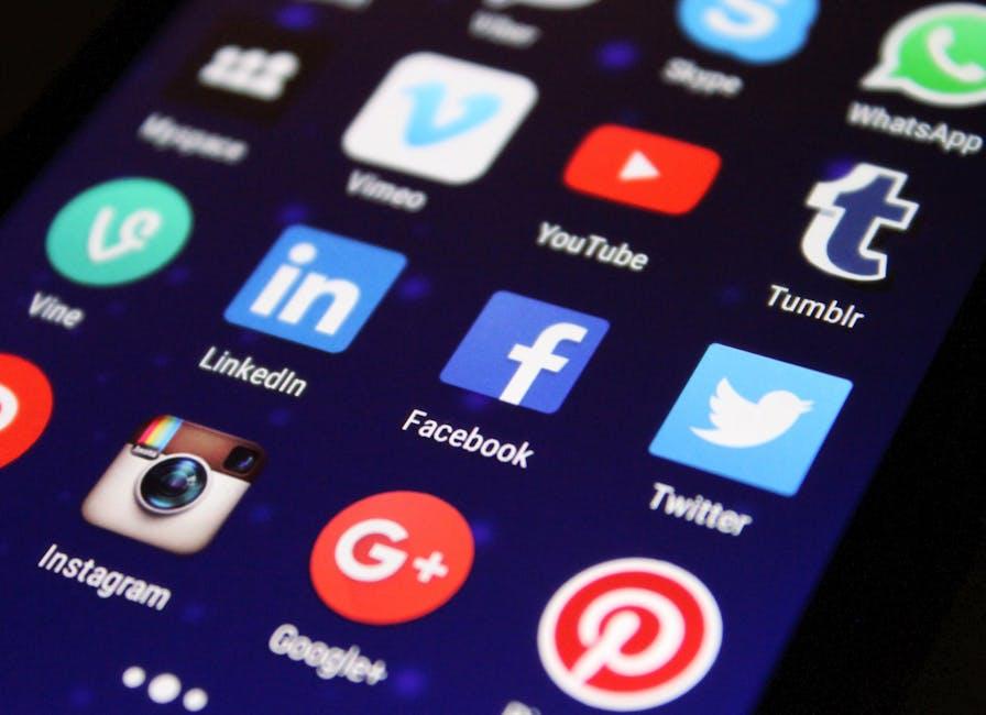
- Social Media Links: Let your audience follow you everywhere!
- Consistent Branding: Incorporate your logo or a specific font style.
Next, let’s talk about layout. A cluttered banner is like trying to read a book in the middle of a concert—impossible! Think of the rule of thirds when placing your elements; it’ll guide the viewer’s eye to the most important information. Consider the dimensions too—ideal for desktop is 2560 x 1440 pixels, but remember to keep critical content within the safe zone (1546 x 423 pixels) to ensure it shows up nicely on all devices. Check out this simple table for more design tips:
| Tip | Description |
|---|---|
| Font Size | Use 48px or larger for readability! |
| Resolution | High-resolution images look sharp on all screens. |
| Test Different Designs | See what vibe resonates most with your audience! |
Tips and Tricks to Optimize Your Banner for Every Device
Creating a banner that looks fantastic on every device is like preparing a pot of the perfect stew; you need the right ingredients and a bit of love! Start by designing your banner with a resolution of 2560 x 1440 pixels. This ensures it looks sharp on larger screens while maintaining quality on smaller devices. When placing text or key visuals, keep them within the safe area (1546 x 423 pixels) to avoid cropping. Imagine it like a cozy blanket: you want those important details to stay snug and visible no matter how the viewer wraps it around their screen!
To take it a step further, consider using layering techniques and contrast in your design. This approach can make your banner pop across various screen sizes. Here are a few quick tips:
- Test across devices: Use your phone, tablet, and desktop to make sure everything looks good.
- Keep it simple: A clutter-free design will shine better across different formats.
- Use bold fonts: They catch the eye and are easier to read!
| Device Type | Optimal Size | Key Element Placement |
|---|---|---|
| TV | 2560 x 1440 | Full Banner |
| Desktop | 2560 x 1440 | Safe Area |
| Tablet | 2048 x 1152 | Center Focus |
| Mobile | 1440 x 2560 | Top 423 pixels |
Key Takeaways
And there you have it! Crafting the perfect YouTube banner doesn’t have to feel like a daunting task. With a sprinkle of creativity, a dash of personal flair, and the tips we’ve shared, you’re well on your way to creating a banner that not only embodies your channel’s vibe but also hooks viewers right from the start. Think of your banner as the welcoming mat to your online home; it should invite people in while giving them a taste of what to expect.
So, roll up those sleeves and dive into the design process! Experiment, play around with colors and fonts, and don’t be afraid to let your personality shine through. Remember, your banner is like your favorite pair of jeans — it should fit just right and make you feel awesome. If you ever feel stuck, just take a break, sip some coffee, and come back with fresh eyes.
Don’t forget to ask for feedback from friends or your audience; sometimes, a different perspective can spark the inspiration you didn’t know you needed! Happy crafting, and may your YouTube channel stand out like a beacon amidst the sea of content. See you in the next video!