Are we witnessing the end of the road for thumbnail designers? You might think so, especially with the rise of AI image tools that are taking the creative world by storm. These digital juggernauts can whip up eye-catching thumbnails in seconds, cherry-picking elements from various sources and mimicking intricate styles. Many creators are feeling the heat, pondering if they can ditch their designer and simply let an algorithm do the work. But hold on a second! Just because a tool can create something visually appealing doesn’t mean it knows how to weave the magic that a skilled human can.
Sure, a flood of pretty thumbnails could drown out the clutter of old-school designs, but beauty isn’t everything. Not all that glitters brings in the clicks! So, what does the future hold for thumbnail designers? Will the market get oversaturated with mediocre thumbnails that are all flash and no substance? And most importantly, how can creators seize this moment to elevate their channels rather than get swept away? Let’s dive deep into the world of thumbnails, creativity, and the surprising ways you can adapt and thrive in this evolving landscape.
The Rise of AI in Thumbnail Design: Are Creators Losing Their Edge?
The surge in AI’s prowess is shaking up the thumbnail design world like a cork popping out of a champagne bottle. With tools now capable of whipping up eye-catching designs without breaking a sweat, it’s tempting for creators to toss their thumbnail designers aside, right? But here’s the kicker: just because a thumbnail looks slick doesn’t mean it resonates. Sure, AI can churn out impressive visuals faster than you can say “clickbait,” but how many creators will actually take the time to understand the psychology behind those clicks? Think about it—cramming every eye-catching element into one thumbnail is like throwing all your ingredients in a pot and expecting a Michelin-star dish. Creativity and strategy are still key players, and AI lacks that human touch that makes all the difference in standing out from the sea of similar designs.
Culture in YouTube thrives on the unique voice of creators, and embracing AI tools doesn’t mean surrendering your creative edge. In fact, those who know how to leverage AI to enhance their ideas rather than replace them will likely emerge victorious. Imagine a world where flashy AI-generated thumbnails dominate the scene, yet a simple screenshot with a quirky twist breaks through the noise. This rebellion against the trend could become your secret weapon! It’s all about being authentic and knowing your audience. Just like good storytelling, effective thumbnail design is about creating curiosity, connecting with your audience, and making them feel compelled to click. So, while some may be quick to wave the white flag, savvy creators who blend intelligence with innovation will find their niche, proving that they’re anything but “cooked.”
Understanding the Three Cs: Making Thumbnails That Actually Work
With the surge of AI tools making it easier than ever to whip up eye-catching thumbnails, you might think that the art of thumbnail design is losing its magic and turning into a cookie-cutter practice. However, there’s a nuanced edge to this situation that many creators are overlooking. The secret lies in the three Cs: create curiosity, convey the idea, and catch the eye. While AI can generate attractive visuals, it often misses the psychological and strategic elements that spark genuine interest. An enticing thumbnail isn’t just about looks; it’s about evoking emotion, hinting at the value of the content, and standing out in an increasingly cluttered digital landscape. If a creator relies solely on the aesthetic appeal without these vital components, they’re likely to nod off while viewers scroll past.
Moreover, despite the influx of AI-generated content, truly effective thumbnail design is about much more than fleeting trends. Good thumbnail designers have an innate understanding of what resonates with viewers—they know what pulls them in and what falls flat. Many creators rush to mimic popular styles, thinking that a flashy design will fetch clicks, but they often overlook the fact that strong storytelling and relatable themes are what viewers crave. Instead of following the crowd, think of how many untapped styles can make your content pop—like a bright flower blooming in a sea of sameness. And as the digital world evolves, embracing authenticity in your thumbnails could not only help you break through the noise but also build a loyal audience that appreciates the unique value you bring to the table.
Embracing the Anti-Trend: Standing Out in a Sea of AI-Generated Thumbnails
In a world where AI can whip up thumbnails faster than you can say “clickbait,” standing out requires a little bit of rebellion mixed with creativity. As the digital landscape overflows with artificially polished images, the real challenge lies in capturing genuine interest. Thumbnail designers have a unique advantage: they understand the psychological triggers that entice viewers to click. While anyone can generate a pretty image with AI, a compelling thumbnail tells a story, stirs curiosity, and creates an emotional connection. It’s like creating a well-crafted book cover; it needs to reflect the essence of the content inside. If the thumbnails look the same, do they really matter? Think about it—would you choose a dull book over one with an intriguing cover, even if the latter was more amateurish? That’s where personality springs into play—an authentic, relatable touch can make even the simplest design pop amidst the chaos of AI-generated noise.
Now, we’re not just in a race against the machines; we’re also in a revolution against trends. Every time a new shiny style emerges, a rebel rises to embrace the anti-trend. Right now, we’re seeing an explosion of high-definition, ultra-contrasty thumbnails that follow the AI mold. And guess what? That’s where the opportunity lies! Just as a splash of red stands out in a black-and-white world, so too does a humble, straightforward thumbnail break through the clutter. Viewers crave authenticity, and when the thumbnails are drenched in artificial flair, it’s those raw, unembellished images that can draw the eye. By tapping into genuine experiences and emotions, designers can turn the AI flood into a unique advantage—making their visuals a beacon in an ocean of sameness. So, as others drown in the barrage of pixels, remember: simplicity paired with storytelling is your secret weapon.
The Future of YouTube Thumbnails: What Creators Need to Prepare For
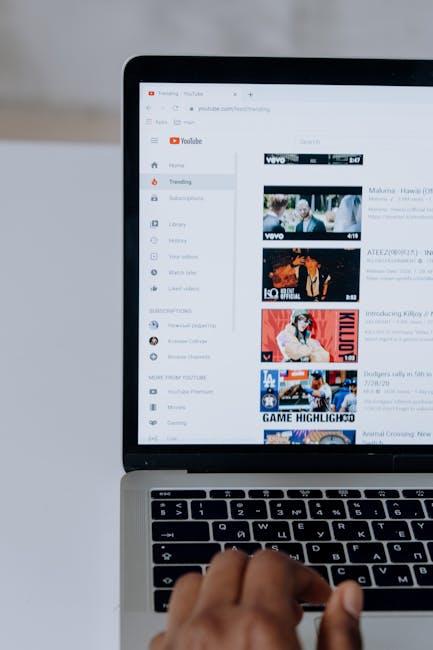
The surge of AI image tools is like throwing a boulder into a still pond; ripples are bound to follow, and the landscape of thumbnail design is shifting dramatically. With anyone able to whip up decent-looking thumbnails, the playground is about to get crowded. But let’s not kid ourselves—there’s a significant difference between simply looking good and effectively grabbing attention. Imagine a sea of shiny, eye-catching thumbnails, only to discover they offer no real substance. The reality is, while the barrier to creating visually appealing thumbnails may be lowered, the art of crafting thumbnails that create curiosity, convey purpose, and catch the eye remains a specialized skill. Creators who rely solely on the surface-level aesthetics will inevitably find themselves disappointed when clicks don’t follow. After all, you can polish a turd, but it’s still a turd, right?
As the algorithm adapts to this influx of glitzy but hollow thumbnails, savvy creators will find unconventional paths to stand out. The key lies in authenticity—a simple screenshot amidst a storm of overly stylized visuals could be buried treasure waiting to be discovered. Think of the counterculture movement; while everyone’s busy sprinting for the latest trending style, the true creative spirit is crafting a unique narrative that resonates with the audience. The algorithm will respond to watch time and viewer engagement more than ever, which means embracing storytelling and genuine connection will be your competitive edge in this AI-driven landscape. After all, it’s not just about being seen; it’s about being remembered.
To Wrap It Up
As we wrap up this blog post, let’s take a moment to digest everything we’ve discussed from the YouTube video “” It’s clear that the advent of AI in the realm of thumbnail creation has sparked quite the debate. On one hand, we have the thrill of watching this technology evolve, making it easier for creators to craft eye-catching visuals. But let’s not kid ourselves—just because you can whip up a decent thumbnail in seconds doesn’t mean it’ll get clicks.
Remember the three C’s: create curiosity, convey your message, and catch the eye. With AI flooding the scene, many newcomers may gravitate towards style over substance, leaving them wondering why their thumbnail isn’t garnering any love—or clicks. It’s a classic case of style versus strategy.
But here’s the silver lining: amidst the chaos, there’s room for those who understand the psychology behind clickable content to thrive. Great thumbnail designers combine creativity with intelligence, and that human touch? AI just can’t replicate it! So, while some may fear for the future of design professionals, it’s likely they’ll adapt and innovate, just as they always have.
If you feel a bit overwhelmed by all this change, don’t stress! Remember, storytelling and watch time will always be king. Keep honing those skills, embrace your unique flair, and leverage AI as a tool—just don’t let it replace your creativity.
And for those of you who are seeking new avenues, don’t forget about the Shorts revolution! There’s always a chance to shine without worrying about thumbnails at all. So, let’s keep the conversation going! If you have thoughts on this topic or want to share your experiences, drop your comments below. And hey, if you’re curious about diving deeper into your channel’s potential, check out the video we discussed. Until next time, keep creating, keep exploring, and remember: it’s your unique voice that will always resonate the loudest!

