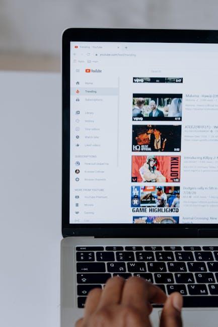
Your YouTube channel’s banner is like the welcome mat to your digital home; it sets the vibe and invites viewers in. But if you’ve ever tried to design one, you know it’s not just about slapping on some graphics and calling it a day. Getting the perfect YouTube banner size is like finding that sweet spot in a Goldilocks tale—too big, and it gets cut off; too small, and it can look like an afterthought. You want it just right! Dive into the details with us, and let’s explore the optimal dimensions, tips for making it pop, and the importance of keeping your branding cohesive across your channel. Whether you’re a seasoned creator or just starting, nailing your banner can make all the difference in capturing those viewers’ eyes. Ready to make your channel shine? Let’s get started!
Finding the Sweet Spot for Your YouTube Banner Dimensions
Getting your YouTube banner dimensions right is like finding the perfect pair of shoes; it can make or break your channel’s first impression. The key is to strike a balance that showcases your channel’s branding while ensuring that important elements aren’t cut off. The absolute ideal size is 2560 x 1440 pixels, but there’s more to it than just hitting those numbers. Different devices display banners differently, so it’s crucial to keep in mind the “safe area” of 1546 x 423 pixels. This is where your text and logos should sit to avoid being cropped on various screens. Thinking of this space as a cozy little nook can help direct your design focus!
To help visualize the sweet spot for your banner, here’s a quick breakdown of some essential dimensions:
| Device Type | Recommended Dimensions |
|---|---|
| TV | 2560 x 1440 px |
| Desktop | 2560 x 423 px |
| Tablet | 1855 x 423 px |
| Mobile | 1546 x 423 px |
Another angle to consider is keeping your background clutter-free while accentuating your brand’s vibe. Think of it like setting up a stage; you want the main act in clear view without distractions! Use bold colors and clear fonts to grab attention, but avoid bombarding your viewers with too much information. Stick to the essentials: your channel name, a tagline, and maybe a logo. Simplicity can speak volumes, drawing people in without overwhelming them from the get-go.

Crafting Eye-Catching Designs that Pop and Engage
When it comes to YouTube banners, you want your design to shine brighter than a supernova in a clear night sky. So how do you make those colors pop and grab attention? First off, consider vibrant colors that contrast well against each other. Think of your favorite candy store—those bold hues make you want to dive right in! And don’t forget to use visible typography; readable fonts are essential for getting your message across quickly. Fancy scripts can look great, but if no one can read your channel name in two seconds flat, you might as well be shouting into the void!
Another game changer? The right imagery. Use high-resolution graphics that encapsulate your channel’s vibe—whether you’re all about gaming, cooking, or DIY crafts. Make a list of things you want to include, such as:
- Central logo or channel name
- Tagline or notable features
- Social media handles
Keeping it simple yet striking is key. And of course, keep the dimensions in check: your banner should be optimized for all devices, so your masterpiece looks killer on any screen. Don’t forget to test how it appears on different devices—like trying on a pair of shoes before you buy!
Optimizing for Different Devices: Ensuring Your Banner Shines Everywhere
When it comes to YouTube banners, one size definitely does not fit all. The key to making your banner fully pop lies in its optimization for various devices. Think of it like dressing your best for a big event; you want to look great no matter who’s watching! Desktop users see the full canvas, while mobile users only get a glimpse. This leads us to the importance of keeping the focal points of your design centered. You wouldn’t want key details getting cut off when someone’s browsing on their phone, right? So, aim for that sweet spot in the middle and ensure that essential elements of your banner—like your logo or channel name—stay visible across all screens.
To break things down further, consider these crucial points when optimizing your banner:
- Aspect Ratio: Stick to 16:9 for the ultimate fit across devices.
- Size Matters: Ensure your dimensions are at least 2560 x 1440 pixels, so it looks sharp everywhere.
- Text Readability: Use bold fonts that are easy to read, even on smaller screens.
Keeping all of this in mind can make a world of difference in how your channel presents itself to viewers, making your banner not just a beautiful image, but also a powerful branding tool!
| Device Type | Optimal Display Area |
|---|---|
| TV | 2560 x 1440 pixels |
| Desktop | 2560 x 423 pixels |
| Tablet | 1855 x 423 pixels |
| Mobile | 1546 x 423 pixels |
Tips and Tools to Create a Stunning Banner Like a Pro
Crafting a banner that pops isn’t just about slapping a few images together; it’s an art form! Start by using the right size – aim for 2560 x 1440 pixels to ensure your banner looks sharp on all devices. Think of your banner as a canvas where your creativity takes the lead. Now, let’s sprinkle in some tools to help you shine like a pro. Check out these awesome options:
- Canva: User-friendly with tons of templates to kickstart your creativity.
- Adobe Spark: Perfect for those looking for customizable features and high-quality finishes.
- Fotor: Great for those quick edits and touch-ups to make your banner sing.
Now that you’ve got the tools, consider using bold colors and eye-catching fonts that align with your brand identity. Balance is crucial—go for a harmonious blend of images and texts without overcrowding the space. An effective layout keeps your audience’s eyes moving like a well-paced movie scene. A simple tip? Reserve the center for essential elements, as this part shows up on most devices, ensuring your channel’s brand shines through. Here’s a quick reference table to help you decide what elements to feature and where:
| Banner Element | Ideal Position |
|---|---|
| Logo | Top Left Corner |
| Channel Name | Center |
| Tagline | Below Channel Name |
| Social Media Links | Bottom Right Corner |
Insights and Conclusions
And there you have it! Crafting the perfect YouTube banner size is like setting the stage for a grand performance—get it right, and you’ll captivate your audience from the very first glance. Remember, it’s not just about dimensions; it’s about creating that eye-catching vibe that communicates your channel’s essence in a split second.
So go ahead, whip out those design tools, and experiment with fonts, colors, and graphics until it screams “YOU!” Keep those guidelines in mind, and your channel will not only attract viewers but also keep them coming back for more. If it feels daunting, just think of it as dressing up your digital storefront—put on your best display and make a lasting impression.
Now, roll up your sleeves and get to creating. Your next viral video could be right around the corner, and all it might take is that perfect banner to pull it all together. Happy designing!