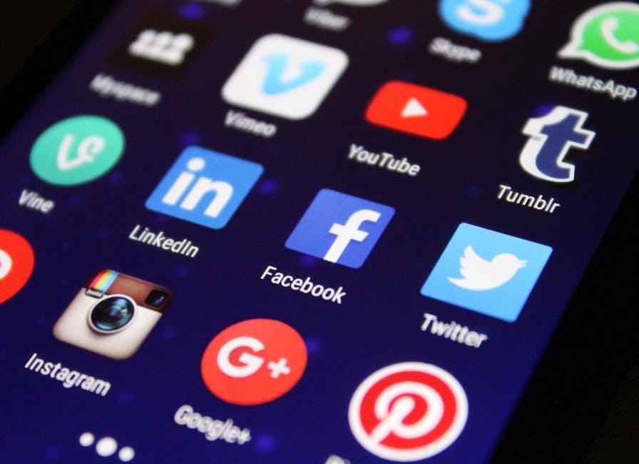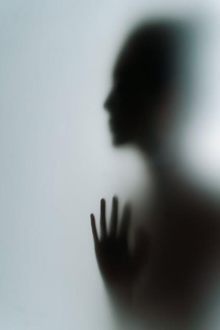
Let’s face it—the internet can feel like a big ol’ glass house sometimes, right? Every click and scroll can leave us feeling a bit exposed. If you’ve ever thought about giving your YouTube profile a more private vibe, you’re definitely not alone. In a world where anyone can peek into our interests, hobbies, and favorite videos, taking control over what we share is a smart move. So, let’s dive in and explore how to make your YouTube profile private, giving you the peace of mind to enjoy your favorite content without the prying eyes of the world. Buckle up—it’s time to embrace your inner privacy ninja!
Understanding Your Privacy Options on YouTube
When diving into YouTube’s privacy options, it’s like exploring a treasure chest filled with gems that can enhance your viewing experience. Start by navigating to your Account Settings. Here, you’ll find a range of options that allow you to control who sees your content. Think of it as setting up a cozy nook in your home that only your close friends can enter. You can choose to switch your subscriptions to private, meaning only you can see who you’re following. Plus, limiting your likes and comments visibility means you can enjoy your favorite videos without the crowd’s chatter echoing in your space.
Next, consider adjusting your video upload privacy. If you’re not quite ready for the spotlight, mark new videos as Private or Unlisted. Unlisted videos are like exclusive invites to a small party—only those with the link can join in! Here’s a quick table to break down these privacy settings:
| Privacy Setting | Description |
|---|---|
| Public | Your video is open for everyone to see. |
| Unlisted | Only people with the link can access your video. |
| Private | Only you can watch your video. |
Getting a handle on these options not only boosts your comfort level on the platform but also ensures a more tailored YouTube journey where you call the shots! By understanding these settings, you’re not just dipping your toes in—you’re diving into the deep end of privacy management. So why not take a few moments to set these controls? Your content, your rules!
Navigating the Settings to Customize Your Profile

First things first, dive into your YouTube settings by clicking your profile picture at the top right corner. It’s like finding the key to a treasure chest, where all your customization options await. Look for the “Settings” option in the dropdown, and you’ll be whisked off to a page filled with everything you need to shape up your profile. From here, head to the “Privacy” section—it’s your go-to place for controlling who sees what. You have the power to hide your saved playlists, subscriptions, and liked videos. Think of it like putting up a cozy little fence around your backyard; you get to choose who steps in for a visit.
Once you’re in the privacy section, toggle the options to your heart’s content. Just a click and voila, you can make your entire channel feel a bit more intimate. Want to keep your channel under wraps? Toggle that setting, and it’s like pulling the curtains closed while the world outside buzzes with activity. If you’re mulling over whether to share your content or keep it more personal, consider making use of the “Manage who can see your content” feature. It’s a simple way to maintain that balance between sharing and safeguarding your creative space. Your YouTube profile is your personal canvas, so paint it exactly how you want!
Tips for Managing Your YouTube Activity and Visibility
Taking control of your YouTube activity starts with understanding what you want to keep private. First off, head over to your account settings and look for the Privacy section. Here, you’ll find some pivotal options that let you decide what stays hidden. Want to keep your saved playlists under wraps? Check the box! Prefer not to let others see your subscriptions? Easy peasy – just toggle that option! Keeping things cozy can help you enjoy your channel without feeling exposed.
But remember, it’s not just about what others can see; it’s about how you engage with the community, too. Consider limiting notifications and comments if you’re not in the mood for interaction. You can customize your notification settings to avoid bombardment from comments or activity on your videos. Staying clear of unnecessary distractions allows you to focus on what truly matters—your content! It’s like curating a personal gallery where only your favorite pieces shine, anxiety-free.
Enhancing Your Online Presence While Staying Under the Radar
Your YouTube profile is like your digital storefront—it shows off your personality and creativity, but sometimes you want to keep it just between you and your close circle. Thankfully, tweaking your profile settings can grant you that privacy. Start by navigating to your account settings and look for the “Privacy” options. Here, you can toggle various settings, such as who can see your subscriptions and who can view your liked videos. This means you control just how much of your YouTube journey is open for public viewing, allowing you to maintain your space while still enjoying the platform.
Consider these useful tips to enhance your privacy on YouTube:
- Disable Comments: If you prefer to keep interactions minimal, turning off comments can give you peace of mind.
- Create Private Playlists: Curate your favorite videos without everyone else knowing what’s on your watchlist.
- Use Incognito Mode: When exploring content, incognito mode lets you search without leaving a trace, ideal for those undercover recommendations.
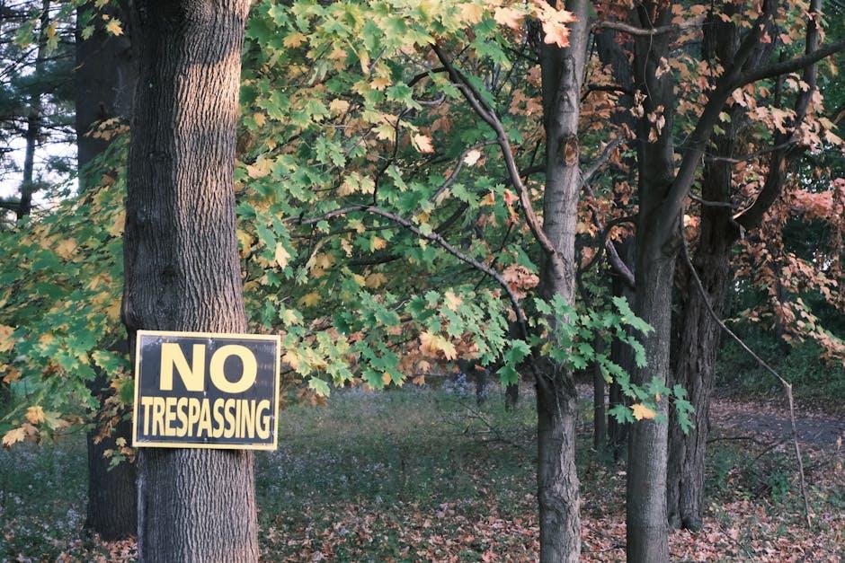
It’s about crafting your own space amidst the vast ocean of content out there. Keeping a low profile doesn’t mean disappearing; it means selectively revealing your interests while safeguarding your digital footprint. So, tailor your settings according to your comfort level and enjoy a customized YouTube experience!
Future Outlook
And there you have it! Taking control of your YouTube profile and making it private is like pulling the curtains shut on a stage—giving you the space to breathe without the world watching. You’ve learned the ropes to tweak your settings, lock down your content, and safeguard your online presence. Now you can dive into your favorite videos, upload that epic content, or simply explore without a spotlight shining on you.
Remember, just like choosing the right filter for your next Instagram post, privacy settings let you curate your online experience. So go ahead, take ownership of your digital footprint; after all, it’s your show! If you have any questions or need a hand with more tips, feel free to drop a comment below. Happy watching, and don’t forget to enjoy creating in your own little corner of YouTube!