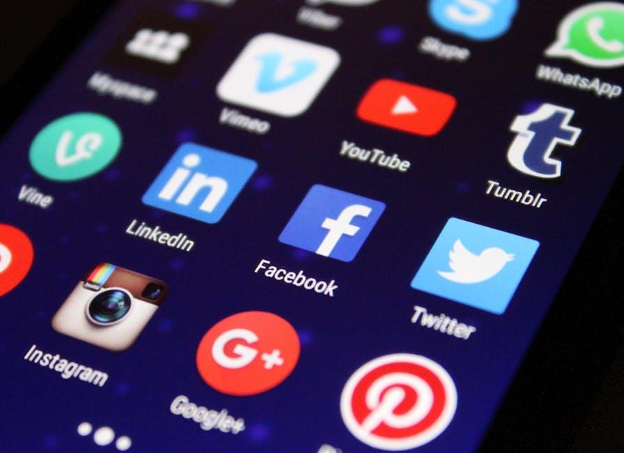
Hey there, fellow creators! So, you’ve poured your heart and soul into your latest video masterpiece, but wait—what about that all-important thumbnail? Think of it as the shop window for your video’s storefront! It’s the first thing viewers see, the irresistible tease that draws them in and makes them want to click. In a sea of endless content, a captivating thumbnail can be the difference between your video sinking like a stone or soaring to the top of the YouTube charts. Sounds a bit dramatic, right? But trust me, it’s true!
In this guide, we’ll break down the art of crafting the perfect YouTube thumbnail into bite-sized, manageable chunks. From choosing the right colors that pop to adding those killer text overlays that convey just the right vibe, we’ll cover everything you need to know. So grab a comfy seat and let’s dive into the colorful world of thumbnails—where creativity meets strategy! Who knows, your next viral hit might just be a click away!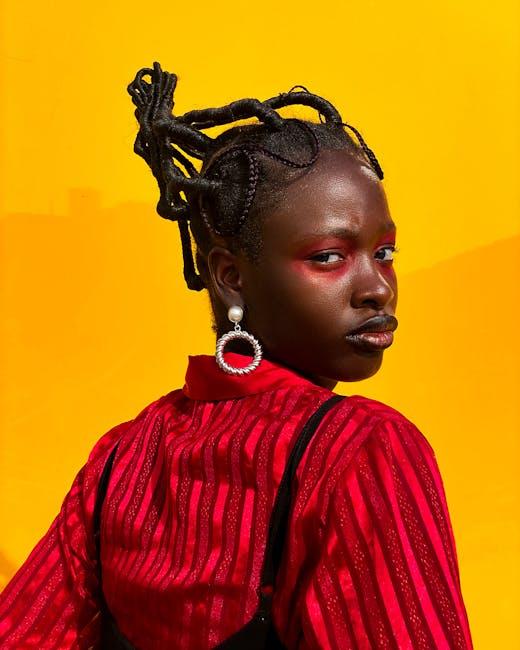
Understanding the Anatomy of an Eye-Catching Thumbnail
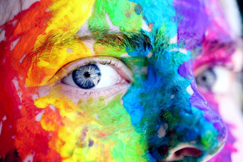
When you think about creating a standout thumbnail, consider it a mini billboard for your video. The anatomy of a great thumbnail is all about visual appeal and clarity. First and foremost, bold colors catch the eye! Think about it—what makes you stop scrolling? It’s usually a vibrant pop of color or an interesting image. Combine that with a high-quality photo that hints at the video’s content. Use expressive faces or captivating action shots; they draw viewers in like moths to a flame. And don’t forget to keep your text concise and legible. A short and punchy phrase can make all the difference—after all, you have just a split second to grab attention!
Another essential aspect is branding. Consistency helps your audience recognize your content instantly! Use the same fonts, colors, or logos across your thumbnails. This way, even if they see your thumbnail without reading the title, they’ll get a sense of familiarity. Consider the following elements when designing:
- Color Schemes: Stick to a palette that reflects your style.
- Font Selection: Choose clear, bold fonts for legibility.
- Imagery: Use high-resolution images that represent the video’s theme.
Here’s a simple table to illustrate the key components:
| Element | Importance |
|---|---|
| Colors | Attracts attention and conveys emotion. |
| Text | Communicates the video’s essence quickly. |
| Images | Visually represents the content, creating curiosity. |
Colors and Fonts That Speak: Choosing the Right Visual Elements
When it comes to creating a YouTube thumbnail, choosing the right colors and fonts is a game changer. Think of it like dressing up for a big party; you want to look sharp and entice people to come over and chat! Bright colors like red and yellow grab attention quickly, while cooler tones like blue and green can convey a sense of calm and professionalism. Depending on the vibe of your video, align your color palette with the emotions you want to evoke. For instance, if your content is upbeat and fun, go for vibrant shades. But if you’re diving into something more serious or educational, consider muted tones that reflect your subject matter.
Now, onto fonts! The typography you choose needs to be as legible as it is eye-catching. You don’t want your audience squinting at the screen, right? A good rule of thumb is to pair a bold headline font with a more understated body font. Here’s a quick list of font styles to consider:
- Sans-serif: Clean and modern; great for a contemporary feel.
- Serif: Classic and trustworthy; excellent for educational content.
- Script: Fun and playful; perfect for lifestyle or DIY videos.
Ultimately, make sure your text contrasts well with the background to stand out. A little experimentation will go a long way—don’t hesitate to play around with both colors and fonts until you find the perfect match that screams “click me!”
Creating Compelling Text: How to Make Your Titles Pop
When it comes to crafting engaging titles, think of them as the shining beacon that draws your audience in. A title should not just state what your video is about; it should evoke curiosity, excitement, and even a sense of urgency. Here are a few tips to make your titles more enticing:
- Use powerful adjectives – Instead of saying “good,” try “epic” or “mind-blowing.”
- Incorporate numbers – Lists catch attention. Titles like “5 Secrets to…” are often more engaging.
- Pose a question – Questions can intrigue viewers. For example, “Are You Making These Thumbnail Mistakes?” sets a dialogic tone.
It’s also essential to know your audience and tap into their interests. Think of your title as a friendly invitation to a party; the more appealing it sounds, the more people will want to show up. A sprinkle of humor can work wonders too! Adding some personality can help your title resonate on a deeper level. Here’s a quick comparison table to illustrate:
| Standard Title | Compelling Title |
|---|---|
| How to Create Thumbnails | Unlock the Secret to Irresistible Thumbnails! |
| Top 10 Tips | 10 Shocking Tips You Didn’t Know About Thumbnails! |

Testing Your Thumbnails: Strategies for Optimization and Improvement
Once you’ve designed that eye-catching thumbnail, it’s time to put it to the test! Consider this your thumbnail’s trial by fire. Start by A/B testing—this means creating two variations of your thumbnail and seeing which one earns more clicks. Take a good look at metrics like click-through rates (CTR) and watch time. After all, what good is a pretty picture if no one is clicking on it? Engaging elements to think about can include bold text, vibrant colors, or even images of people’s faces expressing emotion. People are naturally drawn to emotions; it’s like a magnet for our curiosity!
Don’t just stop there! Once you’ve got data pouring in, dive into the feedback. Keep an eye on the comments section of your videos. Viewers often drop hints of what they like or don’t like about your thumbnails. You may discover trends that help shape your future designs. And remember, it’s all about evolution! Even the best thumbnails need a little TLC over time to stay relevant. Here’s a quick table to outline key metrics to monitor:
| Metric | What It Indicates |
|---|---|
| Click-Through Rate (CTR) | How many viewers clicked your video based on the thumbnail |
| Watch Time | The average duration viewers spend watching your video |
| Comment Sentiment | Positive or negative feedback regarding the thumbnail |
| Shares | How often your video is shared, driven by the appeal of your thumbnail |
Wrapping Up
And there you have it, folks! Crafting the perfect YouTube thumbnail doesn’t have to be rocket science. With a sprinkle of creativity and a dash of strategy, you can create eye-catching visuals that draw viewers in like moths to a flame. Just remember, your thumbnail is the first thing potential viewers will see—it’s your digital handshake, your warm welcome to the world of your content.
So next time you hit “upload,” take a little time to whip up a thumbnail that not only reflects the essence of your video but also sparks curiosity. Experiment with colors, fonts, and images until you find a combination that feels uniquely you.
Now, go forth and unleash your inner designer! Remember, each thumbnail is a chance to make a lasting impression. And who knows? The perfect thumbnail might just be the ticket you need to elevate your channel. Happy creating, and may your click-through rates soar! 🎨🚀