
Let’s face it: in the vast ocean of YouTube content, your video can easily slip beneath the surface if it doesn’t have an eye-catching thumbnail. Think of your thumbnail as the storefront window of a bustling marketplace; it’s what draws potential viewers in, sparking curiosity and enticing them to discover what’s inside. If it’s lackluster or uninspiring, viewers might just walk on by! So, how do you create thumbnails that not only stand out but also reflect your video’s essence? This guide is your secret weapon, packed with tips and tricks to help you craft thumbnails that are as irresistible as a slice of fresh pizza on a Friday night. Ready to turn your thumbnails into click-magnets? Let’s dive in!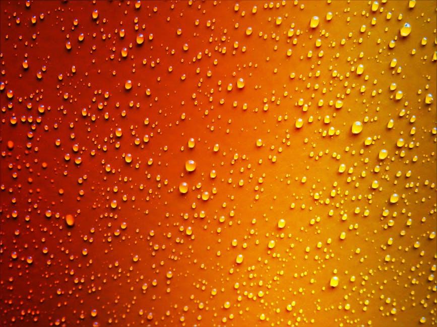
Unleashing the Power of Color: Make Your Thumbnails Pop
Using color effectively in your thumbnails can be a game-changer! Think of color as the spice in your kitchen – too little, and your dish is bland; too much, and it overpowers the other flavors. You want your thumbnails to visually communicate the vibe of your video at a glance. Start by choosing a color palette that aligns with your brand but isn’t afraid to stand out. Here are some color strategies to consider:
- Contrasting Colors: Pair colors that are opposite each other on the color wheel to really grab attention.
- Emotional Hues: Warm colors (like red and orange) can evoke excitement, while cool colors (like blue and green) are more calming.
- Consistency: Use similar colors across your thumbnails to establish a recognizable style.
It’s also crucial to remember that your choices should cater to both the content and audience. If you’re teaching something serious, you might stick to more muted tones, whereas a playful vlog could benefit from bright, bold colors. Think about what message you want to communicate and how color can amplify that. Here’s a tiny table to illustrate how different colors can vibe with your content:
| Color | Vibe | Best For |
|---|---|---|
| Red | Exciting | Action, Adventure |
| Blue | Trustworthy | Education, Tutorials |
| Green | Calming | Health, Nature |
Text That Captivates: The Art of Choosing Fonts and Messaging
When it comes to crafting YouTube thumbnails, the right font can be a game changer. Bold and legible fonts grab attention like a spotlight on a stage. Whether you’re going for a sleek, modern vibe or a quirky, fun look, your choice of typography can speak volumes. Think about your audience—what kind of fonts resonate with them? Mixing styles can add intrigue, but consistency is key. Here are a few font styles to consider:
- Sans-serif: Perfect for a clean, contemporary feel.
- Script: Great for adding a personal touch or a whimsical flair.
- Display: Eye-catching and unique, suitable for titles that need to pop.
Now, let’s talk messaging. Your words should connect with viewers on a personal level, creating a sense of urgency or desire to click. Short, punchy phrases work best—think of them as the trailer to your video! Incorporate an element of mystery or curiosity to provoke interest. Use action words to prompt viewers to engage immediately. Consider this simple table for inspiration:
| Message Type | Example |
|---|---|
| Question | “What Happens Next?” |
| How-To | “Master This Skill!” |
| Challenge | “Can You Handle It?” |
Imagery That Dazzles: Selecting Photos that Tell Your Story
Choosing the right photos for your YouTube thumbnails is like picking the perfect bait to catch a fish; you need something that demands attention and hooks your audience. Think about your video’s theme and mood. Are you going for excitement, humor, or maybe a sense of adventure? Choose images that reflect that vibe. Vivid colors and high contrast can make your thumbnail pop like a neon sign in the dark. Get close-ups of faces or action shots; they have an uncanny ability to convey emotions that resonate with viewers. Don’t underestimate the power of text overlays either. A cheeky phrase or a question adds intrigue and invites clicks. Experimenting with fonts can give your thumbnails a personality that mirrors the content of your video.
To nail the perfect balance, consider this simple checklist before you hit publish:
- Relevance: Make sure the image aligns with your video’s message.
- Quality: Use high-resolution images for crystal clear visuals.
- Branding: Include your logo or consistent colors to make your thumbnails recognizable.
- Text clarity: Opt for readable fonts that stand out against the background.
| Element | Tips |
|---|---|
| Images | Choose vibrant, high-quality visuals. |
| Text | Use bold fonts; keep it short and engaging. |
| Color | Pick complementary colors for eye-catching contrast. |
| Branding | Add your logo to foster brand recognition. |
Mastering Layouts: The Secret to Visual Balance and Harmony
When it comes to designing your YouTube thumbnail, think of it as setting the stage for a grand performance. Each element should play its part in creating a visual melody that draws viewers in. A well-balanced layout involves strategically placing your text, images, and colors to create a captivating harmony. Start by considering these key components:
- Focal Point: Determine where you want the viewer’s gaze to land first, typically the title or a striking image.
- Contrast: Use colors and fonts that stand out against each other to ensure legibility.
- Whitespace: Don’t underestimate the power of empty space! It can give your design breathing room.
Incorporating these elements leads to a thumbnail that doesn’t just look good—it feels balanced. You might think of your layout like a well-composed meal, where every ingredient contributes to the overall flavor. Just like in cooking, a dash of creativity can bring your design to life! Before you hit publish, consider running your thumbnail through a quick checklist:
| Aspect | Details |
|---|---|
| Visual Appeal | Is it eye-catching and relevant? |
| Clarity | Can viewers quickly grasp the content? |
| Branding | Does it reflect your channel’s identity? |
In Summary
And there you have it! Crafting eye-catching YouTube thumbnails is like giving your video a warm hug before it steps out into the world. With vibrant colors, clear images, and text that pops, you’re not just creating a thumbnail; you’re setting the stage for viewers to click, engage, and dive into your content. Remember, every great thumbnail tells a story in an instant, sparking curiosity and drawing people in like a moth to a flame. So, get out there, create those captivating visuals, and watch your views soar! If you have any tips or experiences of your own, drop them in the comments below. Let’s keep the creative conversation going! Happy thumbnail crafting!