Hey there, fellow creators! If you’ve ever found yourself scrolling through YouTube, you know that those little thumbnail images can be the difference between a video that gets clicked on and one that gets buried in the feed. It’s like the cherry on top of a sundae or the cover of a book that beckons you to dive in. In a world where attention spans are shorter than a TikTok video, having an eye-catching thumbnail is crucial to grabbing your audience’s interest. So, if you’re ready to level up your channel’s visual game, you’ve come to the right place! In this quick guide, we’ll walk you through some tips and tricks to make your thumbnails pop, ensuring they stand out in the crowded sea of content. Whether you’re a seasoned YouTube veteran or just starting out, let’s get those creative juices flowing and turn those tiny images into powerful invitations that you can’t resist clicking on!
Understanding the Visual Psychology Behind Thumbnails
When we think about why some thumbnails grab our attention while others blend into the background, it all boils down to the fascinating world of visual psychology. Colors, for instance, play a huge role; vibrant, contrasting colors can evoke emotions and spark curiosity. Just think about how a bright red can trigger excitement, while shades of blue might invoke calmness. Using bold text against these colorful backgrounds not only enhances readability but also helps convey urgency or importance, prompting viewers to click. Ever noticed how some creators use facial expressions? Those close-up shots of excited or surprised faces can create an instant connection, signaling that something great awaits inside the video!
Another factor is the concept of visual hierarchy. It’s essential to guide the viewer’s eye to the most crucial elements of your thumbnail. A well-crafted thumbnail often utilizes a clear focal point, which can be achieved through strategic placement of images and text. Consider a thumbnail with a central image that’s surrounded by smaller elements that support the main message. Stacking text with a dynamic font can also add layers, making it all dynamic and appealing. Here’s a quick look at some effective strategies:
| Strategy | Description |
|---|---|
| Color Contrast | Use colors that pop against each other for maximum impact. |
| Emotive Imagery | Facial expressions that convey emotion can entice viewers. |
| Clear Focal Point | Highlight the main subject to draw attention immediately. |
| Effective Text | Choose bold, readable fonts that communicate your video’s essence. |

Essential Elements that Make Your Thumbnails Pop
When it comes to grabbing attention, your thumbnail is the first little slice of your video the viewer sees, and boy, does it matter! Color is king; vibrant hues hook people’s eyes faster than a baited fishing line. Consider using a contrasting color scheme to draw attention to important elements. Make sure the text is bold and clear. No one wants to squint to read what your video is about! Using fewer words can actually speak volumes. If you’ve got a killer phrase or a punchy title, let it shine! And don’t forget about using high-quality images—blurry pics are like bad first dates; they just leave a sour taste in your mouth.
Another game-changer is incorporating emotional faces. Humans are wired to connect with expressions, so inserting a face that reflects emotion can intrigue viewers and tap into their curiosity. Think about how often you click a video just because someone looks surprised or happy! Utilize branding elements like your channel’s logo or consistent colors to foster recognition over time. Consistency helps build trust and keeps your channel looking sharp. Take a look at the table below for a quick visual reference of successful thumbnail elements:
| Element | Description |
|---|---|
| Color | Vibrant contrasts to attract attention |
| Text | Bold, clear, and less is more! |
| Images | High-quality visuals that pop |
| Facial Expressions | Emotion-driven visuals to engage viewers |
| Branding | Consistent color schemes and logos for recognition |

Color Schemes and Fonts that Capture Attention
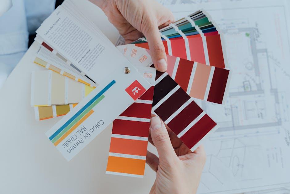
Choosing the right color scheme can be the difference between a scroll and a click. Bright, vibrant colors often grab attention, especially when they contrast sharply with each other. Think about it this way: a neon green against a dark background can feel electrifying. Meanwhile, pastel colors can evoke a sense of calm and curiosity, perfect for niche topics. When picking colors, aim for a harmonious palette that reflects your brand’s personality. You could use tools like Adobe Color or Coolors.co to create eye-catching combinations. Here’s a quick list of popular color schemes that work wonders:
- Complementary colors – Opposites on the color wheel, like blue and orange.
- Analogous colors – Colors that are next to each other, like yellow, yellow-orange, and orange.
- Monochromatic colors – Variations of a single hue for a sleek look.
Now, let’s chat about fonts. The right typeface not only helps convey your video’s theme but also makes the text easier to read at a glance. Bold, sans-serif fonts like Arial or Montserrat are often more legible, especially on smaller screens. It’s a bit like picking out the right outfit for a party; you want to look good, but comfort matters too! Creatively blend different font weights and sizes to create hierarchy—make your title pop while keeping supporting text more subdued. Here’s a simple breakdown of font choices:
| Font Type | Vibe |
|---|---|
| Sans-Serif | Crisp, modern, and easy to read. |
| Serif | Classic and elegant, great for storytelling. |
| Script | Personal and stylish, adding a unique touch. |

Optimizing Thumbnails for Maximum Click-Through Rates
Creating a thumbnail that grabs attention is crucial because it’s the first thing potential viewers see. Think of your thumbnail as the storefront window of your video – if it’s not appealing, people will walk right past it. To maximize click-through rates, you should focus on using bold colors, big, clear fonts, and high-quality images. Combine enticing visuals with text that teases your video’s content, like a cliffhanger in a novel. The key is to evoke curiosity while ensuring it’s still easy to read. Remember, less can be more; cluttered thumbnails can confuse viewers rather than attract them.
Don’t forget about the power of faces! Thumbnails featuring expressive human faces tend to perform better because they create an emotional connection. If you’re incorporating text, always ensure it’s legible even in smaller sizes. Here’s a quick checklist to keep in mind while designing your thumbnails:
- Contrast: Use contrasting colors to make elements pop.
- Branding: Include your logo for consistency across videos.
- Visual Hierarchy: Highlight the most critical information at a glance.
- Testing: Consider A/B testing different thumbnails to see which performs best.
| Element | Tip |
|---|---|
| Color | Use vibrant colors to grab attention |
| Text | Keep it short, catchy, and readable |
| Images | Use high-resolution and relevant images |
| Emotions | Facial expressions can draw in viewers |

The Way Forward
And there you have it, folks! Crafting eye-catching YouTube thumbnails isn’t just a nice-to-have; it’s an absolute game-changer for your channel. Think of your thumbnail as the front cover of a book—if it doesn’t grab attention, who’s going to want to dive into what’s inside? By employing bold colors, clear text, and striking images, you’re not just enticing viewers; you’re inviting them into your creative world. So, roll up your sleeves, channel your inner artist, and start experimenting!
Remember, the perfect thumbnail might just be a few clicks away. And don’t be afraid to mix things up; a little trial and error can lead to some incredible results. So get out there, have fun with it, and watch your engagement soar! Thanks for joining me on this thumbnail adventure. If you have any questions or cool tips of your own, drop a comment below. Until next time, keep creating and keep shining! 🌟

