Ever scroll through YouTube and get smacked in the face with a banner so sharp it could cut glass? Yeah, a killer banner can truly make or break your channel’s first impression. Think of it like the storefront of a boutique; it needs to be inviting and eye-catching to pull folks in. You don’t want viewers hopping away to the next channel because your banner looks like it was thrown together in five minutes. So, let’s roll up our sleeves and dive into the art of crafting a YouTube banner that not only grabs attention but also showcases your unique vibe. Get ready to elevate your channel with stellar designs that pop!
Choosing the Perfect Dimensions and Layout for Maximum Impact
When it comes to making a statement with your YouTube banner, choosing the right dimensions and layout is like laying the foundation for a house—you want it to stand out and feel inviting. The standard size for a YouTube banner is 2560 x 1440 pixels, but don’t let that scare you. Think of this space as your digital canvas where creativity flows. To ensure your artwork grabs attention, it’s essential to keep important elements within the safe area of 1546 x 423 pixels. This way, you can be sure your text and key visuals won’t get cropped on different devices, keeping your message clear and engaging whether someone’s viewing on a phone, tablet, or TV.
Your layout plays a pivotal role in how visually appealing your banner will be. A clean and organized approach can make all the difference. Consider these tips for maximum impact:
- Create balance: Make sure your images and text complement each other without overwhelming the viewer.
- Focus on branding: Incorporate your logo prominently to boost brand recognition.
- Minimalist Design: Less is often more, so avoid cluttering your banner with too many graphics.
- Bold Colors: Use a color scheme that reflects your channel’s personality but remains pleasing to the eye.
| Aspect | Dimension | Importance |
|---|---|---|
| Full Banner Size | 2560 x 1440 pixels | Optimal display on large screens |
| Safe Area | 1546 x 423 pixels | Prevents cropping on all devices |
| Minimum Size | 2048 x 1152 pixels | Good quality for most layouts |
Harnessing the Power of Color and Typography in Your Banner Design
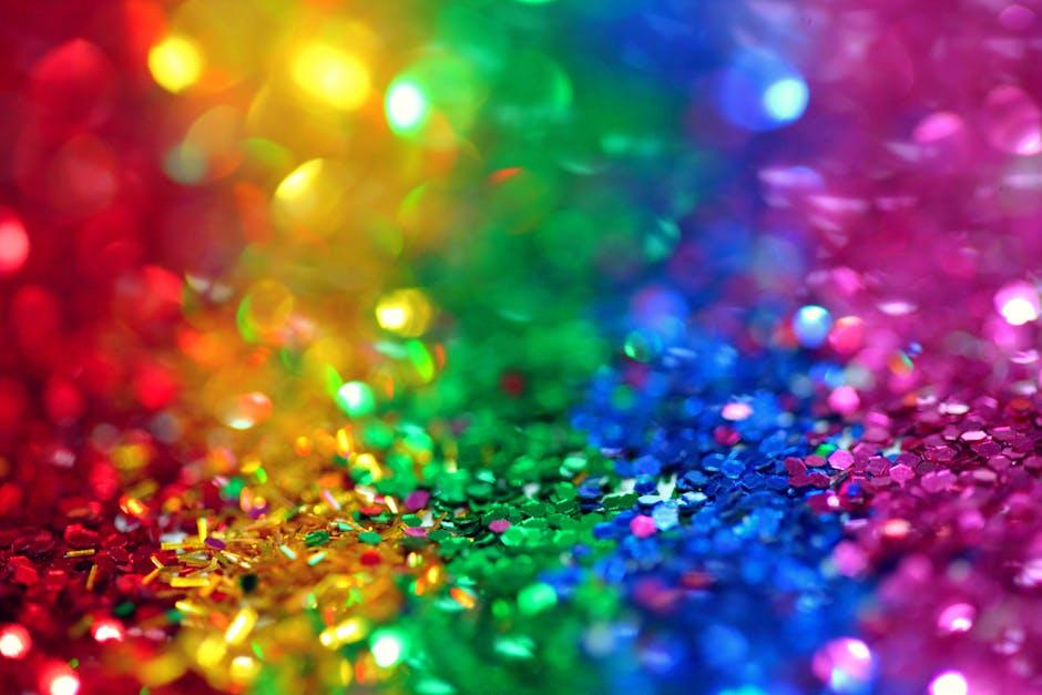
When creating your YouTube banner, color is your best friend. The hues you choose can evoke emotions, set the mood, and even define your brand personality. Imagine walking into a room painted bright yellow—it instantly brightens your day, right? Similarly, colors like red can add excitement, while blue offers a sense of trust and calm. Think about your target audience: what colors resonate with them? Here are some tips to nail it:
- Color Palette: Stick to 2-3 primary colors to keep it cohesive.
- Contrast: Use contrasting colors for text to ensure readability.
- Brand Colors: Incorporate your brand colors for recognition.
Typography is equally crucial; it’s like the voice of your banner. The right font not only communicates your message but also captures attention. Imagine reading a serious message in a playful font—it just doesn’t work! Choose a font that aligns with your channel’s vibe. For instance, if you’re running a cooking channel, a handwritten script can feel warm and inviting. Check out this quick comparison of font styles:
| Font Style | Vibe | Best For |
|---|---|---|
| Sans-serif | Modern | Tech Reviews |
| Serif | Classic | Book Reviews |
| Script | Creative | DIY & Crafts |
Incorporating Your Brand Personality to Stand Out from the Crowd
Creating a YouTube banner isn’t just about aesthetics; it’s your chance to shout your brand personality from the digital rooftops! Think of your banner as a first date with your audience—what vibe do you want to convey? Consider integrating elements like color schemes, fonts, and imagery that truly reflect who you are. Are you a laid-back vlogger? Maybe a soothing palette with casual fonts would do the trick. On the other hand, if you’re a tech guru, sharper, bold visuals paired with modern typography can really set you apart from the pack.
To nail that distinct brand voice, focus on these essential components:
- Consistency is Key: Match your banner style with your content themes.
- Emotional Appeal: Use visuals that evoke feelings—happiness, excitement, or even curiosity.
- Unique Touch: Add a personal element, like your logo or a signature design feature.
Don’t forget to treat your banner like a living piece of art—update it periodically to reflect new content or changes in your brand! By staying fresh and authentic, you’ll not only captivate your viewers but keep them coming back for more.
Tips and Tools for Designing Like a Pro, Even If Youre Not a Designer
Designing your YouTube banner doesn’t have to be a Herculean task, even if you’ve never considered yourself a designer. Start by leveraging some user-friendly tools that make the process feel like a walk in the park. Canva is a crowd favorite, allowing you to choose from a plethora of templates tailored specifically for YouTube banners. Just drag and drop your images, play around with fonts, and voilà! Your creative juices will be flowing like a river. Additionally, Adobe Spark is another gem, offering stellar customization options that can make your banner look truly professional without the steep learning curve.
But hey, it’s not just about the tools; it’s also about the essentials that can elevate your design. Here’s what to keep in mind:
- Brand Consistency: Use colors and fonts that reflect your channel’s vibe to create a cohesive identity.
- High-Quality Images: Invest in or source high-resolution images; pixelation is a design nightmare!
- Text Hierarchy: Make sure your channel name stands out, possibly in a larger or bolder font compared to other text.
- Call-to-Action: Encourage viewers to subscribe or check out your latest videos right on the banner!
| Tool | Key Feature | Cost |
|---|---|---|
| Canva | User-friendly templates | Free with optional premium features |
| Adobe Spark | Advanced customization | Free trial, then subscription required |
| Snappa | Quick design tools | Free plan available |
Insights and Conclusions
And there you have it—your go-to guide for whipping up YouTube banners that don’t just catch eyes but also capture hearts. Think of your banner as the front porch of your digital home; it’s the first thing visitors see, and you want it to feel welcoming and uniquely yours. Whether you’re promoting a quirky travel vlog, a makeup channel, or a channel dedicated to the love of video games, a stunning banner sets the vibe and lets viewers know what to expect.
Remember, the key is all in the details—bold colors, cohesive fonts, and those little touches that showcase your personality. Don’t forget to keep it updated as your channel evolves; your banner should grow alongside your content.
So, roll up those sleeves, grab your favorite design tool, and let that creativity shine! Your subscribers are waiting, and with a captivating banner, you’re one step closer to making those clicks turn into loyal fans. Happy designing!

