You know that feeling when you stumble upon a YouTube channel with a banner that just grabs your attention? It’s like a warm invitation that says, “Hey, come on in!” Crafting that perfect banner isn’t just about slapping on a few images and calling it a day; it’s an art that combines creativity with a splash of strategy. Whether you’re a seasoned content creator or just dipping your toes into the vast ocean of YouTube, having an eye-catching banner can make all the difference. It’s your first impression, after all! In this simple guide, we’ll walk you through the essential steps to create a standout YouTube banner that not only reflects your personality but also entices viewers to hit that “subscribe” button. Ready to make your channel pop? Let’s dive in!
Understanding the Perfect Dimensions and Design Elements for Your Banner
Creating a banner for your YouTube channel is more than just a quick project; it’s like sculpting a piece of art that represents your brand. First off, let’s talk dimensions. YouTube recommends a banner size of 2560 x 1440 pixels. This ensures your banner looks sharp on any device, whether it’s a mobile, tablet, or desktop. But hold on! Keep key elements within the safe area of 1235 x 338 pixels to make sure they’re not cropped out on different screens. Think of it like framing a picture—your important stuff needs to fit perfectly in the center!
Now, let’s move on to design elements. Using the right color palette is crucial. Stick to two to three primary colors that reflect your channel’s personality. Fonts should be bold and easily readable—no one wants their viewers squinting. Incorporate elements such as your logo, taglines, or images relevant to your content. If your channel is all about adventure, consider using dynamic visuals like mountains or maps. Here’s a quick reference table for some popular color palettes and their vibe:
| Color Palette | Vibe |
|---|---|
| Ocean Blues | Calm and Trustworthy |
| Bright and Bold | Creative and Energetic |
| Earthy Tones | Natural and Grounded |
By paying attention to size, color, and design elements, your banner will not only catch the eye but also communicate your channel’s essence at a glance. So, roll up those sleeves, get creative, and make a visual impact that resonates with your audience!
Choosing the Right Color Palette to Reflect Your Brand Identity
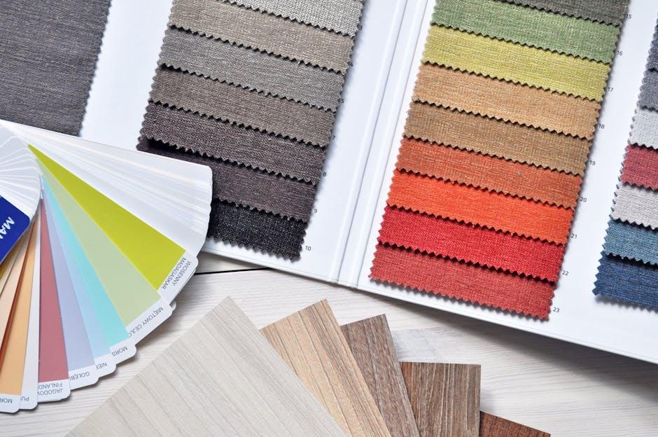
Choosing the perfect color palette is like picking the right outfit for an important date; it sets the mood and communicates who you are without saying a word. Colors evoke emotions, so you need to find a combination that resonates with your audience. Start by identifying your brand’s personality: is it bold and energetic, or calm and soothing? Consider diving into color psychology to see what emotions different hues can stir up. For instance, blues can instill trust and reliability, while reds can evoke passion and excitement. Don’t forget to limit your palette to a few key colors—too many might turn your banner into a chaotic mess that confuses viewers instead of captivating them.
Making choices can be overwhelming, so simplify things with a short list of dos and don’ts when selecting colors. It helps to create a mood board that pulls from various inspirations—think about nature, patterns, or even other brands you admire. Here’s a quick tip: use analogous colors for a harmonious feel or complementary colors for a bold statement. Consider these points:
- Consistency: Ensure colors align with your overall branding.
- Contrast: Use contrasting colors to make important elements pop.
- Accessibility: Keep in mind color blindness and make sure your visuals are inclusive.
Lastly, once you’ve narrowed down your options, test them out against your content. Sometimes, colors look different on screen than they do in your head. A simple mock-up can help you see if your choices truly represent what you want to convey. Remember, your color palette is a visual handshake with your audience—make it warm and inviting!
Crafting Eye-Catching Text That Captures Attention
When you’re designing your YouTube banner, the text is the hook that reels in your audience. Choose your words wisely—they need to pop like fireworks on the Fourth of July! Use bold fonts and contrasting colors to create a striking visual that demands attention. To make your message clear at a glance, focus on short and snappy phrases. Think of your text as the spotlight in a theater; it shouldn’t just illuminate the stage but also tell a compelling story. Consider using catchy taglines that resonate with your content, like a catchy jingle that sticks in your mind.
Another key aspect is the placement of your text. It should flow seamlessly with the overall design, enhancing the visuals rather than overwhelming them. Ensure your font size is legible on various devices and scales nicely as your viewers’ eye travels across the banner. Also, remember the mighty power of white space— it can make your text stand out even more. You might even want to create a quick comparison of text styles to see what resonates best. Here’s a simple table to help visualize some effective text options that you can play around with:
| Text Style | Use Case |
|---|---|
| Bold | For headlines or key messages |
| Italic | For emphasis or quotes |
| All Caps | For urgency or announcements |
| Lowercase | For a casual or modern feel |
Incorporating Images and Graphics for Maximum Visual Appeal

Let’s face it: a banner without imagery is like a sandwich without filling—just plain and lacking excitement. To really grab attention, think about using a mix of bold colors, striking graphics, and perhaps even some sharp photos that resonate with your channel’s theme. Don’t shy away from experimenting! You can use tools like Canva or Photoshop to layer images that represent who you are. For example, if your content is all about travel, incorporating a stunning landscape or a vibrant city skyline can instantly convey your niche. It’s like setting the stage for a performance; that visual context is what pulls viewers in and makes them curious about what you have to say.
Moreover, consider the importance of balance and clarity. You don’t want a cluttered mess where the eye doesn’t know where to land. Incorporate your channel name and key information in a readable font that pops against your backdrop. Use a ranking system for the visual elements to prioritize what should stand out—your logo, channel title, and perhaps a catchy tagline should take the front row. Below is a simple visual hierarchy table to guide your design:
| Element | Importance |
|---|---|
| Channel Name | ⭐️⭐️⭐️⭐️⭐️ |
| Logo | ⭐️⭐️⭐️⭐️ |
| Tagline or Slogan | ⭐️⭐️⭐️ |
| Imagery/Graphics | ⭐️⭐️⭐️ |
This approach ensures that while you showcase your personality and content theme, your banner remains visually appealing and effective. Remember, a well-thought-out design isn’t just for aesthetics; it serves as an invitation for viewers to dive deeper into what you have to offer!
Insights and Conclusions
And there you have it—your roadmap to creating YouTube banners that not only catch the eye but also encapsulate your channel’s vibe! Think of your banner as the welcoming mat to your video content; it should invite viewers in, pique their curiosity, and give them a taste of what’s to come. Remember, it’s all about experimenting! So grab your design tools, let your creativity run wild, and don’t shy away from trying out bold colors or quirky fonts. As you dive into this creative journey, keep in mind that the perfect banner won’t just look good; it’ll resonate with your audience and reflect who you are. Now go out there and transform those pixels into a visual masterpiece that’ll make your channel shine brighter than a thousand suns! Happy designing!