
You ever scroll through YouTube and get drawn in by a thumbnail that just pops? Those little images are like the storefront windows of the video world, beckoning you to step inside and explore. Crafting eye-catching thumbnails isn’t just some optional extra; it’s essential if you want to get noticed in a sea of content. Whether you’re sharing your travel adventures, diving into gaming, or giving tips on baking, a killer thumbnail can make all the difference. So, let’s dive right into this simple guide and unlock the secrets to creating thumbnails that not only catch the eye but also keep it glued to your channel! Ready to turn heads? Let’s get started!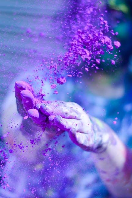
Unleashing the Power of Colors and Contrast in Your Thumbnails
Colors are your best friends when it comes to captivating viewers at first glance. Bright and bold hues draw attention faster than a kid at a candy store. Think about the emotion you want to evoke; for instance, red can convey excitement or urgency, while blue suggests calmness and trust. When pairing colors, consider using a color wheel for complementary shades that create a striking visual impression. You could go with classic combos like yellow and purple, or experiment with quirky palettes to keep things fresh. Don’t underestimate the power of contrast either; it can make your text pop against the background, ensuring that your message is crystal clear. A few simple tweaks to your color choices can be the difference between a “meh” thumbnail and one that’s bursting with personality.
Contrast isn’t just about colors—it’s also about designing elements within your thumbnail. Use a mix of fonts, sizes, and shapes to create hierarchy. For instance, place the title in a larger, bold font while keeping subtitles smaller yet legible. Here are some handy tips to elevate your thumbnails:
- Layering: Overlap images or text to create depth.
- Shadows: Adding a slight shadow to your text can enhance readability.
- Borders: Use borders or backgrounds to prevent your elements from blending into one another.
Small changes can lead to significant improvements, transforming your thumbnail into a magnet for clicks.

Crafting Attention-Grabbing Text That Speaks Volumes
Creating a YouTube thumbnail that captivates your audience isn’t just an art; it’s a science! Start with vibrant colors that pop off the screen. This can be likened to a delicious candy wrapper that draws you in. Use contrasting hues to make the text stand out and easily legible. Think about the mood you want to convey—are you going for fun and playful, or serious and informative? Selecting the right color palette can be the difference between a scroll and a click.
Another key element is the use of bold images and text. Whether it’s a close-up of a surprised face or a striking background that complements your content, a well-chosen image can tell a story in an instant. Incorporate essential details like the video title or a tagline, keeping the text to a minimum. You don’t want to overwhelm viewers; it’s all about clarity. Utilize simple yet effective design techniques, such as:
- Large Fonts: Choose readable fonts that are easy on the eyes.
- Minimal Text: Less is more; keep it concise and to the point.
- Clear Focus: Make sure there’s a focal point that drives the viewer’s attention.
To illustrate the impact of effective thumbnails, here’s a quick comparison:
| Thumbnail Type | Impact |
|---|---|
| Professional Design | Higher engagement and trust |
| Cluttered Design | Confusion and lower clicks |
Remember, your thumbnail is often the first impression of your video, so make it count! Engage your audience visually and let your creativity flow!

The Art of Using Imagery: Choosing the Right Visual Elements
When it comes to crafting those eye-catching thumbnails, choosing the right visual elements is like picking the perfect toppings for a pizza—get it right, and everyone wants a slice! Color is your first weapon; use bold, vibrant shades to grab attention. Think about contrasts, too. You want your text to pop against the background, right? Play around with elements like shapes and icons to guide the viewer’s eye. Here are some quick tips:
- Use faces: Thumbnails that feature expressive human faces can evoke emotions and create a connection.
- Limit text: Keep it brief—few words can say a lot, but too many drown out your message.
- Consistent style: Make sure your thumbnails align with your brand’s overall aesthetic to create a familiar feel.
Another aspect to pay attention to is composition. Think of it as framing a picture; you want the most important elements to guide the viewer’s focus. Try the rule of thirds—position your key visuals along those lines or at their intersections for balance. While you’re at it, don’t overlook the power of negative space; it can make your key elements stand out even more. Here’s a quick reference table for some visual element ideas:
| Element | Purpose |
|---|---|
| Bold typography | Increase readability & impact. |
| Contrasting colors | Draw attention & create hierarchy. |
| Visual storytelling | Engage emotions & create intrigue. |

Testing and Tweaking: How to Fine-Tune Thumbnails for Maximum Impact
Fine-tuning your thumbnails is like finding that perfect seasoning in a recipe—just a little tweak can make all the difference. Start by testing a variety of designs and layouts to see what grabs attention the most. You can experiment with different images, colors, and text styles. For instance, try to incorporate bold fonts that are easy to read or a striking color palette that pops against the backdrop. Don’t underestimate the power of high-quality images; they act as the first impression your viewers get. Consider running A/B tests by uploading alternative thumbnails to see which one pulls in more clicks. It’s all about that trial and error until you find the combination that resonates with your audience.
Another effective strategy is to analyze the performance metrics of your thumbnails over time. Check out your click-through rates (CTR) and audience retention data. This info can provide insights into what’s working and what’s falling flat. You might want to keep track of key factors in a simple table, like so:
| Thumbnail Design | CTR (%) | Viewer Retention (%) |
|---|---|---|
| Option A: Bright Colors | 8.5 | 70 |
| Option B: Dark Background | 5.2 | 65 |
| Option C: Text-Heavy | 6.0 | 72 |
Once you gather enough insights, you’ll start to notice trends. Maybe your audience loves a particular color or image style, and that can guide your future thumbnail creations. This approach ensures that every visual element serves a purpose: to entice people to click and ultimately enjoy what you create.
Closing Remarks
And there you have it—a quick and easy guide to crafting those eye-catching YouTube thumbnails that can turn casual scrolls into curious clicks! Remember, your thumbnail is the front door to your content; make it inviting, intriguing, and a tad irresistible. As you dive back into your creative space, experiment with colors, fonts, and images that resonate with your style and message. Don’t be afraid to think outside the box—after all, the more unique your thumbnails, the more likely you are to capture attention in a sea of content. So roll up those sleeves, unleash your creativity, and watch as your views and engagement start to soar. Happy thumbnail making!